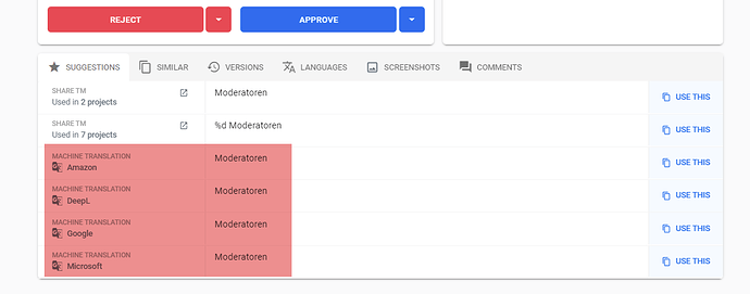
There are often many identical suggestions, each requiring vertical screen space.
It would make the app better usable when identical suggestions could be merged per group. See picture below. In this sample all four Machine Translations could be merged to one line, with maybe on the left side: “Amazon, Deepl, Google, Microsoft” or “All” as label.
See also related topic: Improve usability on devices with smaller screen real estate
