[Minor] Scrollbar on “Your translation” isn’t displayed properly

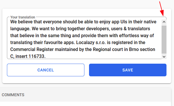
Currently, when you create a long translation, a scrollbar will appear on the right. This scrollbar does not span to the top as the scrollbar on the Source phrase does; this creates a gap. I think it would be good to increase the size of the scrollbar to the top.
obrazek

Hello,
This is most probably issue with Vuetify. We’re progressively getting rid of it anyway, so soon it will come to rework of this page and it will disappear from here as well. Thank you for reporting!