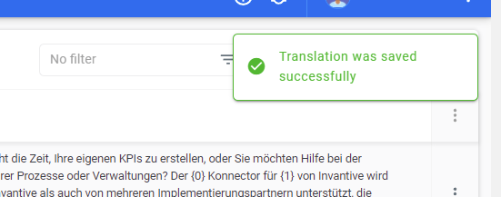
The search field and the feature requests/bug button in the top-right of the screen are often covered by a progress message such as shown below (“Translation was saved successfully”).
When continuously searching for other terms, the user has to wait a second over and over, which decreases productivity.
Suggestion display progress message in a screen area that has no user controllable components and/or is complete empty.